in the whole proces. From assignment to final illustration.
So for this job the briefing was quite short; It had to be an A5 sized illustration that was accompanying
an article on how children with a criminal parent had a much bigger chance of becoming criminal
themselves if their parents were also divorced.
The client asked for some simple idea sketches. I was actually very happy about that, since I'm
not one of those illustrators who spent hours on gorgeous sketches that almost look identical
to the final illustration. I usually give my clients simple rough sketches to show them the idea,
and then I surprise them (and myself) with the final illustration.
For this illustration I tried to steer away from the visual clichés for divorce like cracked floors
and torn photographs, and came up with two ideas;
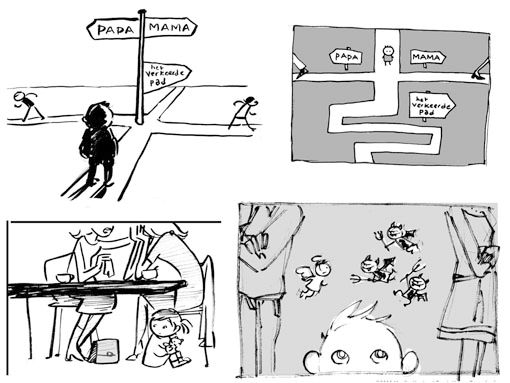
1-Crossroads, with one arrow pointing to 'the wrong path' (little textual joke).
I made two sketches for that, one more realistic, the other more abstract and graphic.
2-A divorced mother, and her young daughter under the table, who seemed very interested in the
friend's purse. I got the idea because less supervision from parents can contribute to criminal behaviour.
-Then the client came with an idea of their own: Divorced parents and a child that had three
little devils instead of one! It's a strong visual but I rejected it because I saw no connection
between the divorce and the devils in the illustration. Still the client wanted to see how it
would look to make a decision, so I made a quick sketch.
The client chose the sketch of the abstract roads. The most daring sketch in my opinion so
I was happily surprised, usually clients are more conservative.
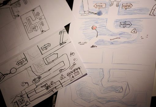
I started sketching and found out that they also picked a difficult sketch. It was hard to find
a place for the sign with 'wrong path'. I planned to put some criminal stuff along the road and
let it end in a jail, but while sketching I decided to keep it more simple to make a stronger
visual. (Aaargh…. I always chose concept over form...)
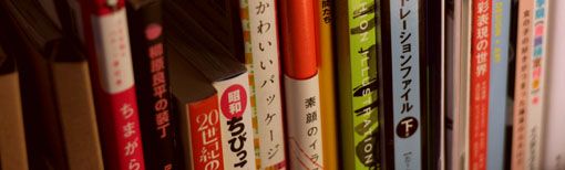
Now I got a bit clueless on how to continue, so I turned to my pile of Japanese illustration
books for inspiration. I picked up a book of one of my favorite Japanese illustrators; Ryohei
Yanagihara.
I liked the paper structure in these bookcovers and decided to try making the illustration
with paper. So I tore up a page of a photograph magazine and started glueing and drawing.
By that time I had already forgotten about Ryohei Yanagihara and just did what I liked myself.
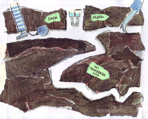
This was the result, made on a simple sheet of printer paper, drawn with pencils and ink.
At the art academy they tried to teach me how to make these perfect original illustrations, but now
I'm so grateful for computers; I can make a big mess and turn everything okay again with Photoshop.
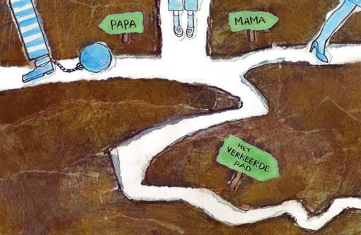
So I scanned the illustration and started tweaking it in Photoshop. I changed the colours,
made it the right size (the path needed to be resized) and used some rough brushes to add
a bit of texture to the paper scraps.
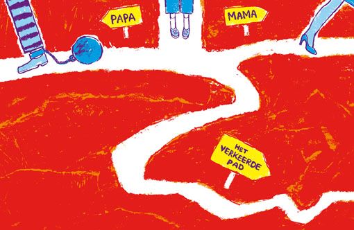
I was happy with the end result but this illustration had an extra condition; the magazine used a
strict colour palette and wanted the illustration to fit in. I had tried to imitate the company's colours,
but with my paperscrap technique it was of course impossible to get the colours exactly right. I got
worried that my illustration would not be approved... Maybe I had to start anew?
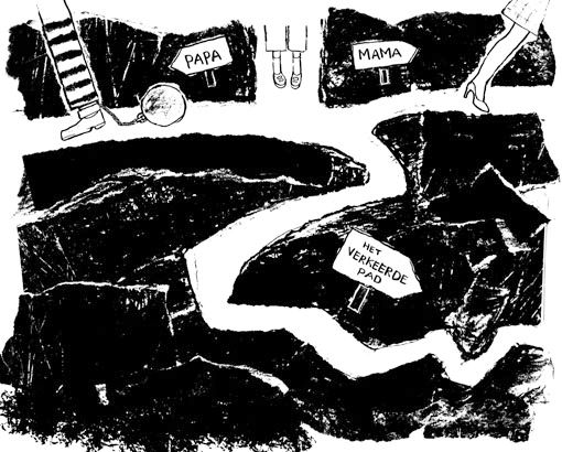
But while scanning I had noticed the black and white preview of the illustration, and it looked
interesting... So I made another scan, but this time in black and white.
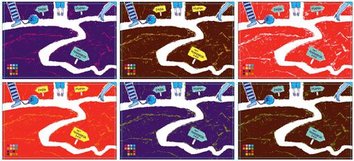
I adjusted the illustration a bit and then tried different colours from the palette.
And here's the final! I don't usually make several versions of one illustration, but in this case
I sent them both to the client so that they could choose the one they liked best.
They chose the last version in red, which I was pleased about as well, they have bold taste!
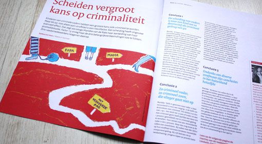
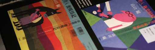
The illustration in print.
So anyway, this is why it's hard for me to show elaborate sketches beforehand. My sketches just
show a rough concept and the final illustration might change a lot along the way. It's not the right
or wrong way, just the way I personally work best.

Leuk om te zien, thanks :-)
ReplyDeleteLeuk om eens te zien hoe je werkt Maaike!
ReplyDeleteGrtz Anne