
Hi everyone, I wanted to show you the process of an assignment, from brief to final illustration.
And especially the process of searching for a good idea, because I believe that is one of the most
important aspects of my work.
So one of my clients, an accountant company, asked me to design a pictogram (logo) for an internal
project about putting ideas from employees to the test. The brief I got was short, and consisted mainly
of some buzzwords like ‘out-of-the-box’, ‘together’ and ‘challenging’. Pretty generic, so I worried a bit
about how I could turn this into an interesting visual, without getting too close to a stock illustration of
a lightbulb…
But then I started thinking and sketching, followed by some more thinking and sketching…
...... and then I had all THIS!
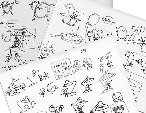
As you can tell my sketches are one big mess! But I’ll never show these to clients, they’re just to help me.
It’s hard to escape the lightbulb as a symbol for ‘ideas’, but I tried some other things as well…
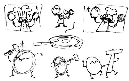
.....like an egg! With a chef, thinking of how to cook it (= test and execute the idea) and a hammer,
ready to crack it open and release the idea’s potential.
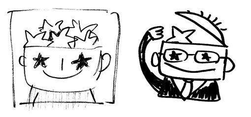
And then I went on to stars!
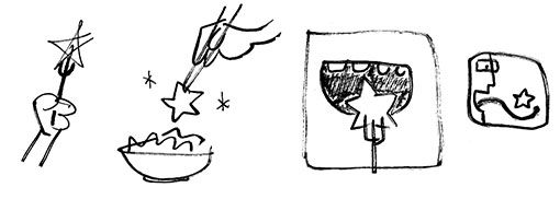
I even combined these into the tasting of an idea (testing it).
But then I worried that people might mistake it for a cooking course, and I turned all my sketches down.
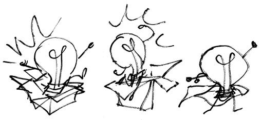
So it was back to the lightbulbs, and I did a few lightbulbs, bursting out-of-the-box, that then turned
into some kind of superhero-lightbulb.
But these also got turned down (by me) because they seemed a bit too simplistic and boring.

I also thought about ‘challenging’ (mentioned in the brief) and drew some boxing lightbulbs.
But since the project was not an idea-competition, that visual didn’t seem to fit completely either.
(wow, this is one rough sketch… Can you still make out the boxing bulbs in this sketch?)
This is also when I started noticing how the wire inside the bulbs seems to give them eyes.
Check out the mean looking one at the right!
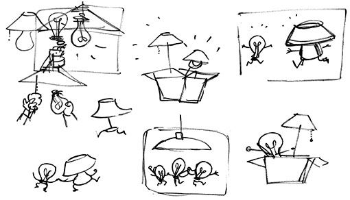
Then I thought again about the purpose of the project: Testing ideas. And of course lightbulbs are tested….
.... in a LAMP!
So I started drawing lightbulbs and lamps, running to each other, hands putting them together, or trying to
get out-of-the-box…
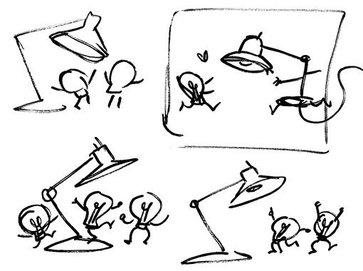
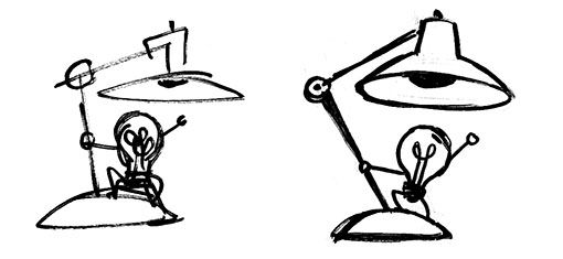
I quickly switched to a desk lamp, more fitting for an office, and tried different poses and multiple bulbs.
The bulbs were all excited to be tested in the lamp, but that made it look like they were dancing. So I made
some new sketches with a bulb just holding the lamp and striking a powerful pose.
Then suddenly, the pose in that last sketch reminded me of an astronaut planting a flag on the moon…
... and I knew I found my pictogram.
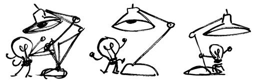
I worked out the sketch and then decided this was going to be it. Usually I send in several ideas to my clients,
but I felt like this sketch was so strong I wanted to stick to it.
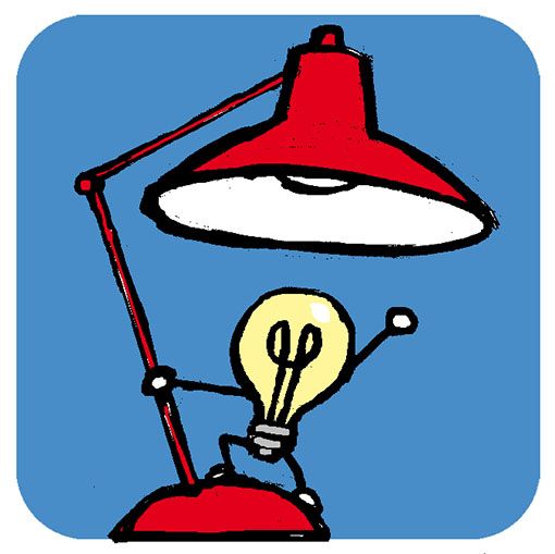
I scanned my last sketch, adjusted it in Photoshop (I especially made the ‘joint’ of the lamp smaller
because that made it look a bit old fashioned), added some colour and send it off.
Fortunately my client loved the idea just as much as I did and immediately gave his approval!
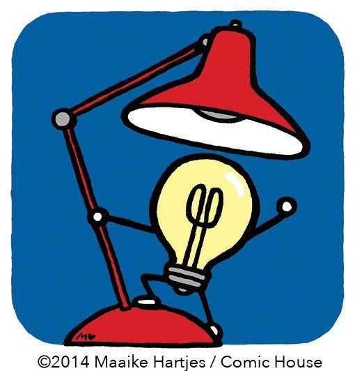
In the final I decided to enlarge the bulb to put more focus onto it. I also slightly tilted his fist to give
the bulb a more powerful gesture. My work is often so minimalistic that such a small thing already
makes a big difference.
I traced the borders of the background by hand to give them the same drawn feeling as the illustration
itself. Oh, and I had to change the blue colour to the official company blue.
That’s it!
All assignments are different of course, but hopefully this did give an impression of how I put my
illustrations together.


Cool. I like your dancing light bulbs.
ReplyDeleteWas the client happy too?
Thank you, and yes they were! Great client to work with. :-)
ReplyDelete